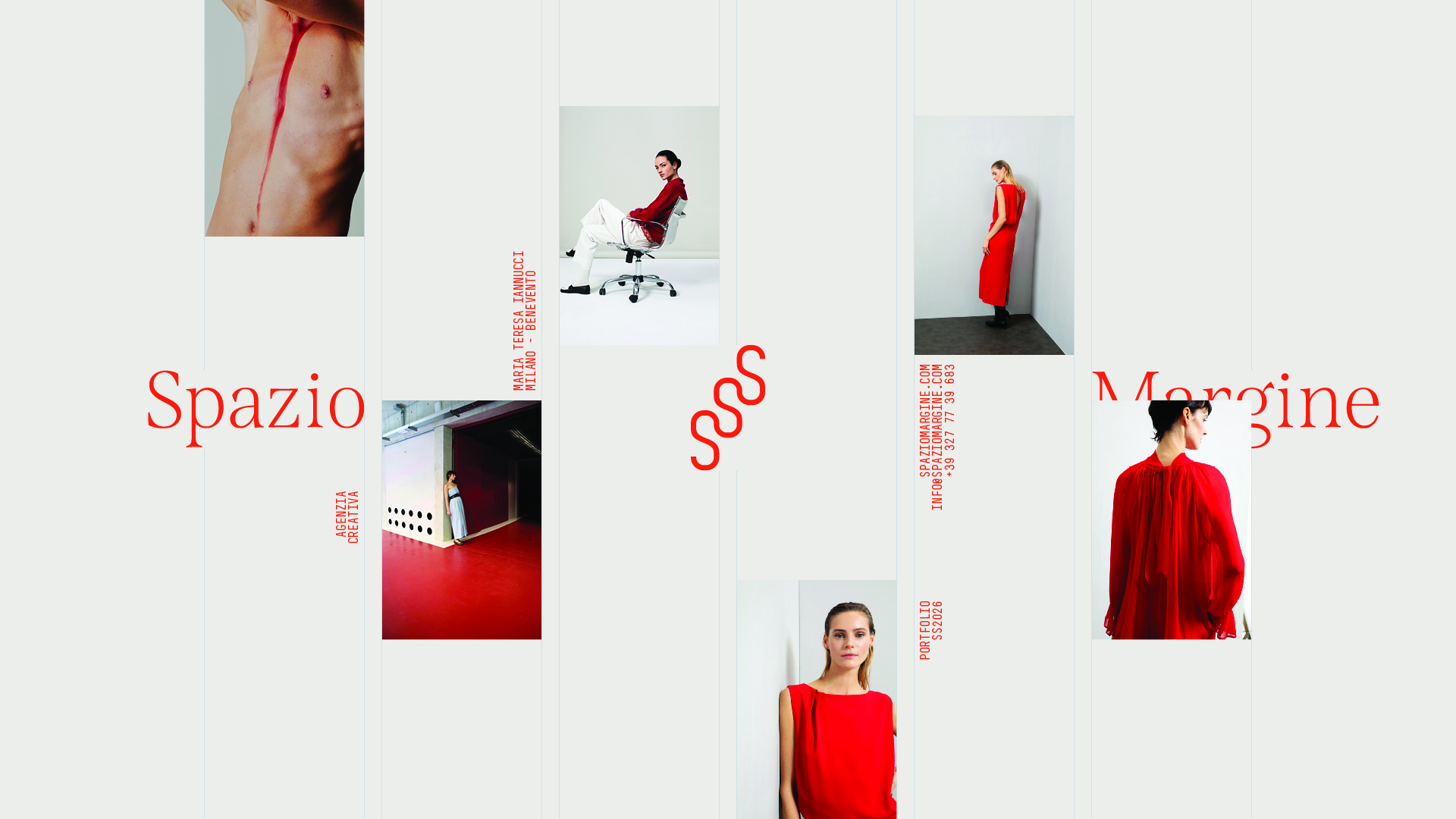
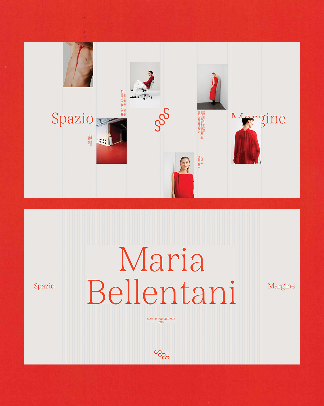
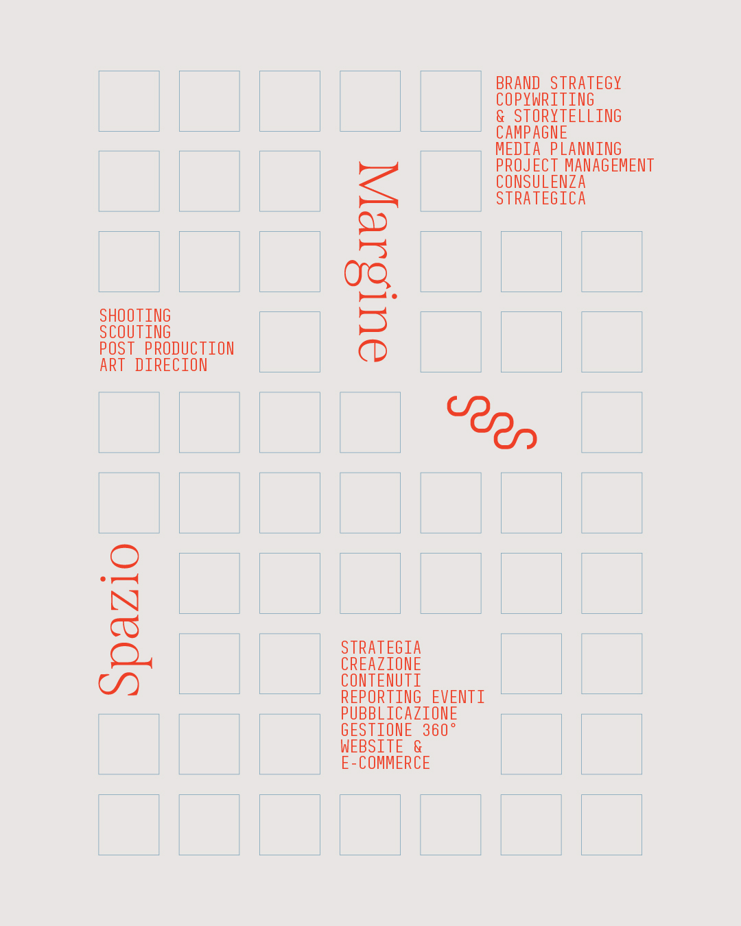
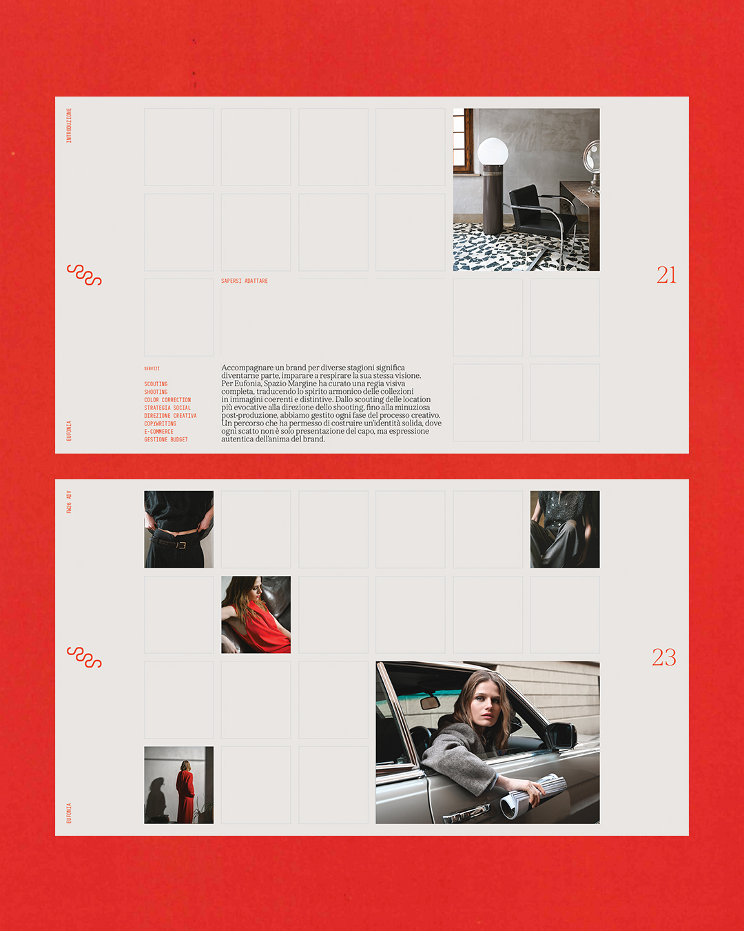
Spazio Margine
Brand Identity & Portfolio for Spazio Margine, a contemporary photography studio. From visual strategy to digital experience, the project aimed to define the studio’s voice, building everything around the core concepts of transparency and a client-centered approach.
READ MORE*

No items found.
No items found.
The goal was to establish a system where structure equals honesty. The grid became the visual metaphor for transparency: a layout that doesn't hide anything but organizes content with absolute clarity. From the website's interface to the editorial layout of the portfolio, every element was designed to reflect a client-centered approach, where the process is as visible and reliable as the result.